Tempur-Pedic
Holiday Campaign & Identity
Focusing on the benefits of life-changing sleep speaks to the product and the ways it can transform lives. The campaign embraces every part of the Tempur-Pedic family, using owners and owner-created photography to personalize the product and bring it to life in the home.
Role: Art Direction, Design & Layout, Visual System, On-Set Art Direction (photographer and stylist)
Product Photography by Wendi Nordeck
Holiday Direct Mail Catalog Cover


Holiday Direct Mail Catalog spreads
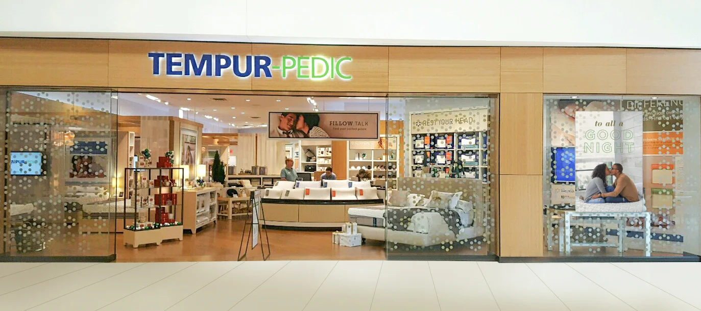
Tempur-Pedic Flagship store front
Art Directed Holiday Campaign Photography
Animation screensaver created for Flagship stores and third-party retailers
Animation by Adam Gill
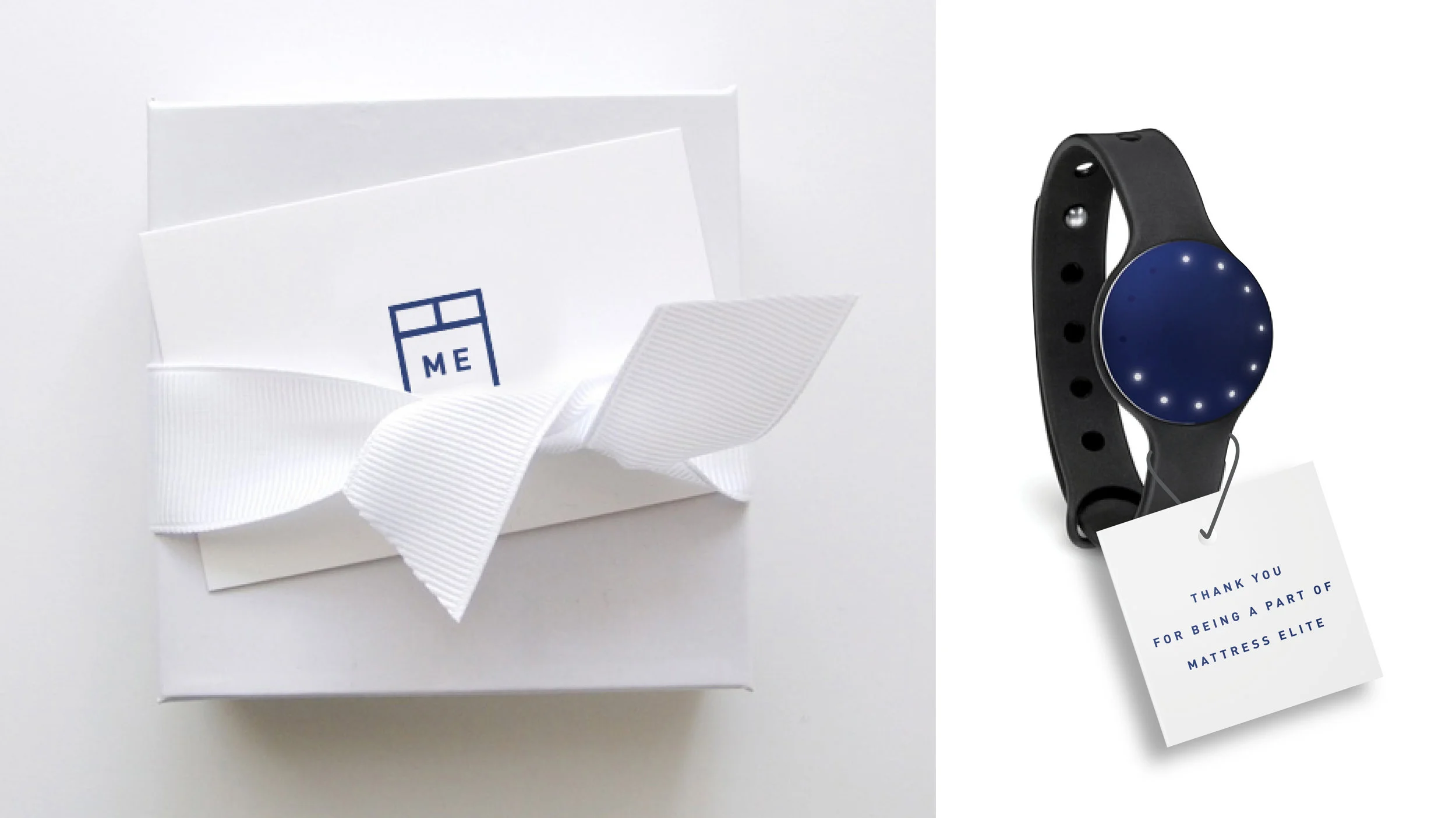
Tempur-Pedic Mattress Elite
THESE PHOTOS SPARKED THE IDENTITY OF THE 25TH ANNIVERSARY PRODUCT LAUNCH. WITH A FOCUS ON BOLD CONTRAST, BLACK AND WHITE NEUTRAL TONES KEPT THE IMAGES CLEAN, MODERN, AND BRIGHT WITH HINTS OF RAW TEXTURE. EACH DETAIL BROUGHT TO LIFE THE LIFESTYLE RELEVANT TO THEIR NEWEST TARGET CONSUMER- MILLENNIALS.
Role: Concept, Design, Identity Development
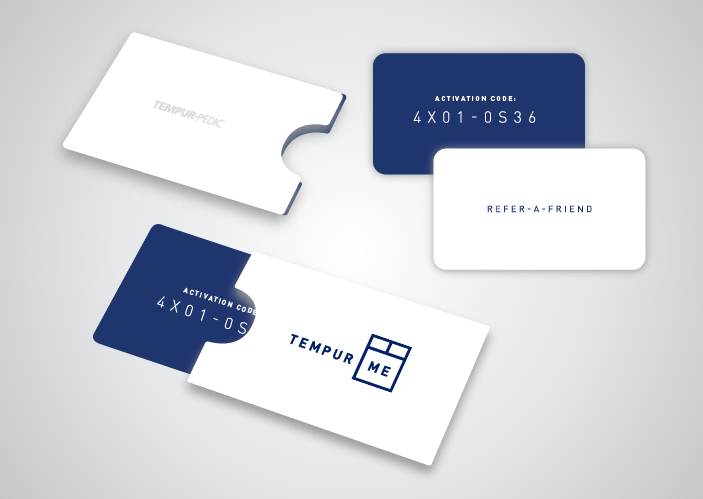
Gift with purchase
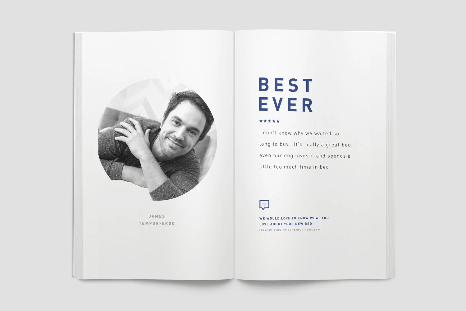
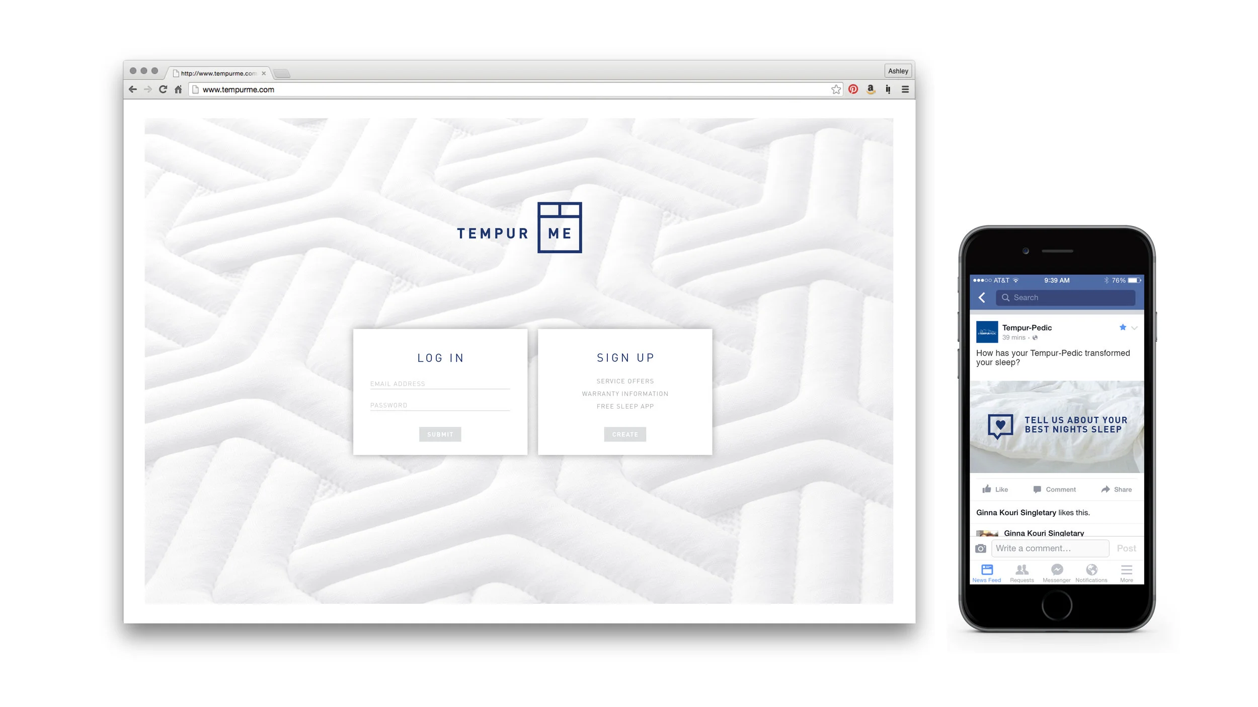
Membership Microsite & Testimonial Activation
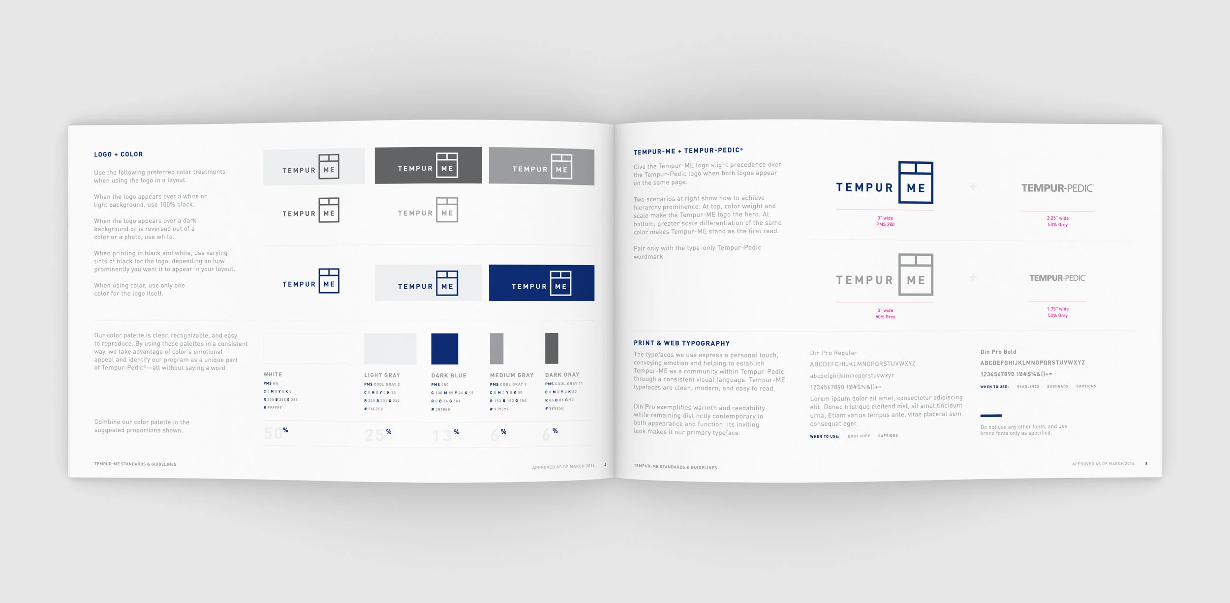
Tempur-Me Brand Guidelines
25 years of Tempur-Pedic
Product Release
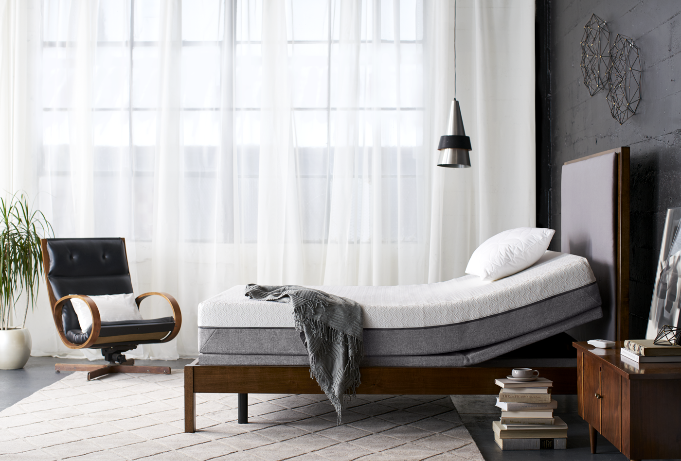
These photos sparked the identity of the 25th ANNIVERSARY product launch, focusing on bold Contrast, and black and white neutral tones, the INDUSTRIAL LOTS PACKED WITH CHARACTER AND MID-CENTURY DETAILS. CLEAN, MODERN, AND BRIGHT WITH HINTS OF RAW TEXTURE made this lifestyle RELEVANT to their newest target consumer, MILLENNIALS.
ROLE: Concept, On-Set Art Direction (photographer and stylist)
Photography by Sean Dagen
Direct Mail Catalog Spread
Designed at Figure 8 Creative for Tempur + Sealy International


